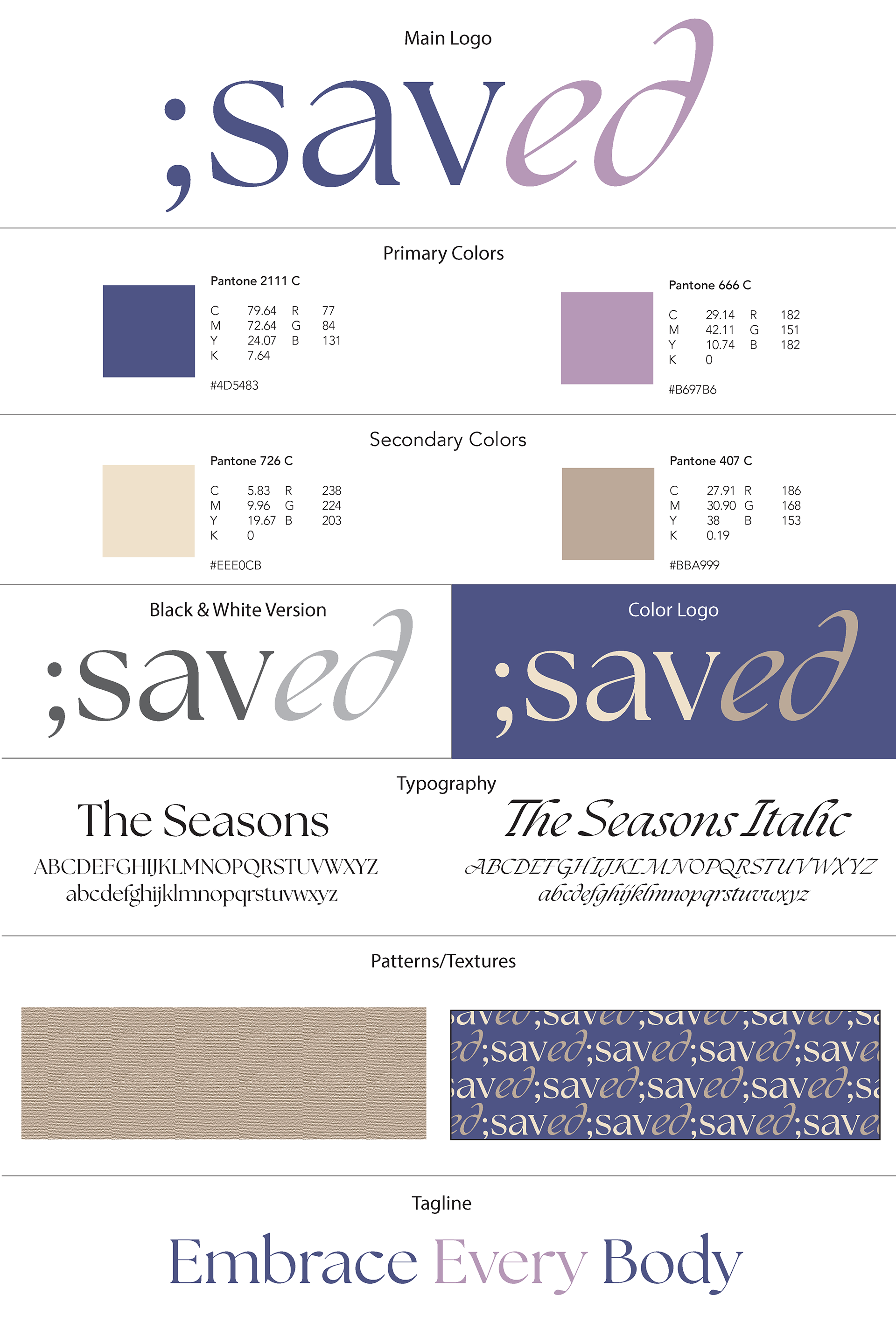
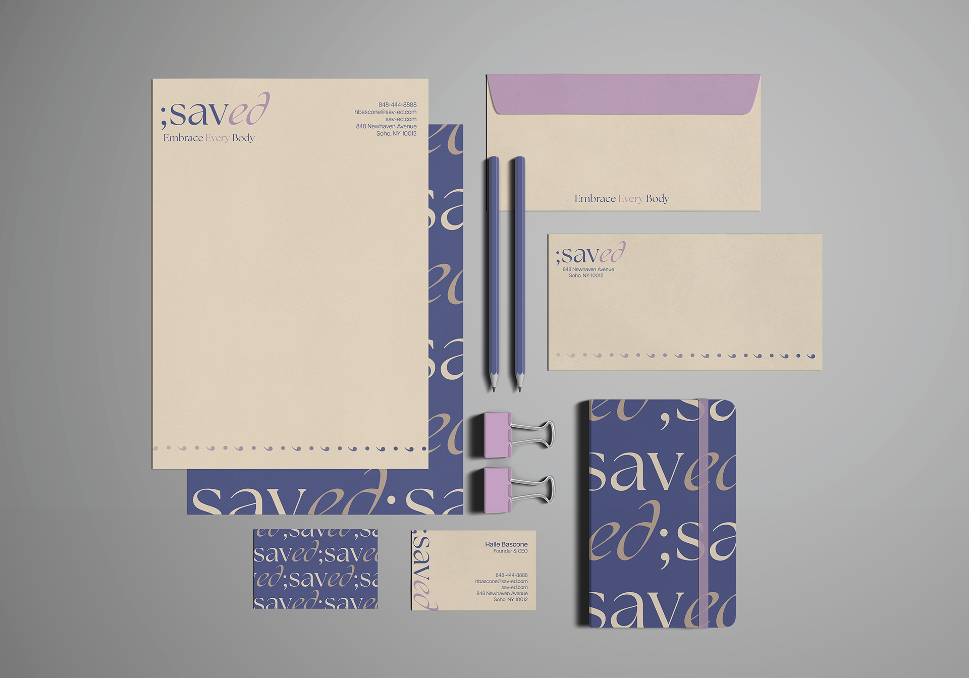
Saved - Non-Profit Thesis Project for Senior Portfolio - 2024
The semicolon, which stands for resiliency and hope, is the branding focal point for the nonprofit organization Saved, which focuses on eating disorders. Lilac is a color of attentiveness, while creamy and light brown tones are used as comforting hues. My goal for the company is to share compassion, encouragement, and assistance with healing.
Software used: Illustrator & Photoshop
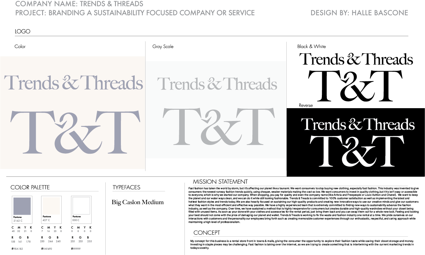
Trends & Threads - Sustainability Company for Graphic Design 2 - 2023
I've included a serif typeface with a modern twist—the "&" symbol—into my elegant design. The arrow within stands for recycled and gently used apparel, which is the foundation of our eco-friendly company and represents the essence of sustainability. Through multiple design revisions, I set out on an exploration quest to find a more mature and unisex appearance. Though I struggled to choose between my earlier ideas, there was no denying the pull of this specific design—it embodies our dedication to environmental conscience and has enduring appeal.
Software used: Illustrator
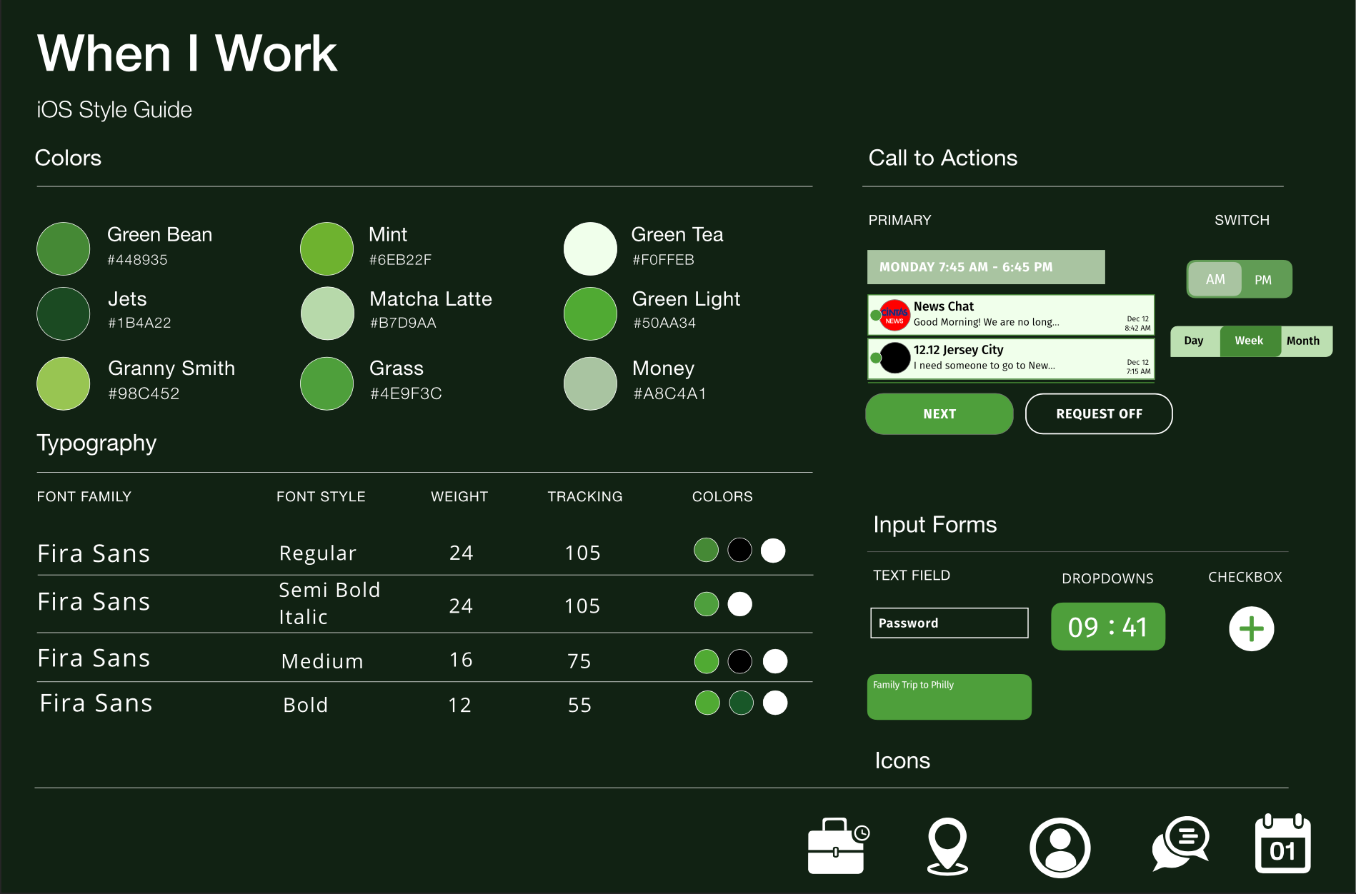
When I Work - UI/UX App Revision for Graphic Design 3 - 2023
When I Work is a complete solution to optimize your business processes, not just an app for staff scheduling. In addition to making work scheduling easier, it also improves staff accountability, lowers the number of justifications, stimulates communication, keeps track of attendance and time, and supports business expansion. To make the experience more visually appealing and user-friendly, I've also expanded and refined the original color scheme. The updated color scheme makes the app more straightforward and visually appealing, making it enjoyable for users to interact with.
Software used: Illustrator
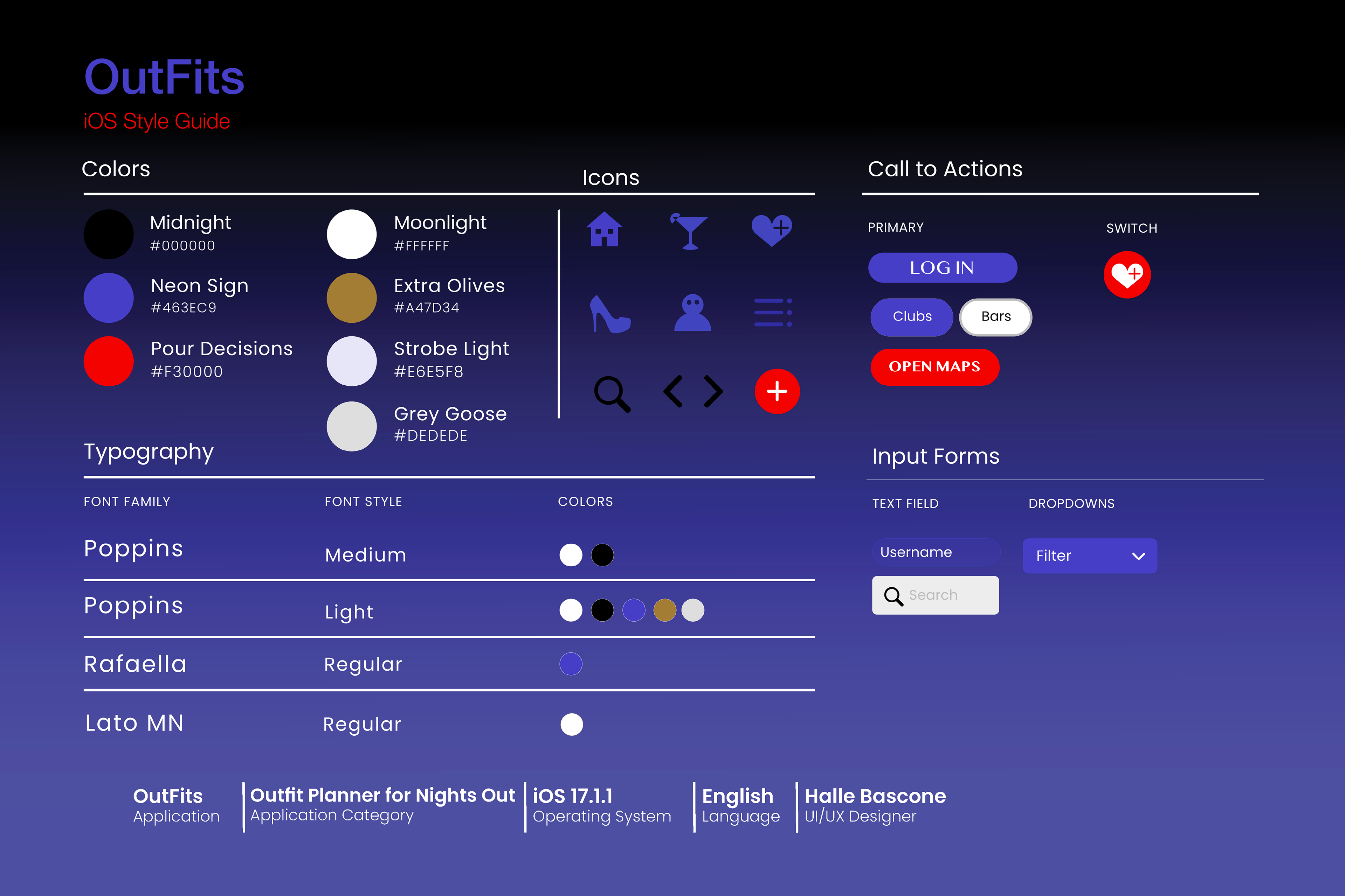
OutFits - Original App Design for Graphic Design 3 - 2023
With the help of the app OutFits, users can easily arrange their outfits by coordinating their looks, seeing what their friends are wearing, and finding clothes that work for various nightlife settings. The design emphasizes "OUT" in the logo to reflect bar and club logos and "fits" with a retro neon sign style. Bold red and purple hues were used to depict the nighttime and clubbing environment.
Software used: Illustrator